http://kosikcomputers.weebly.com/website-poster.html
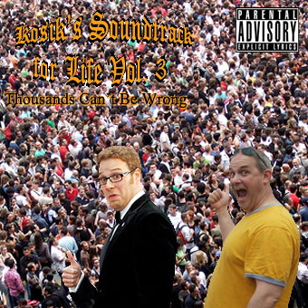
The presence of the crowd background and the other elements along with it, achieve unity in depicting the meaning of the entire work. What's nice about this work is that the elements present are individually significant in expressing the idea. Nevertheless, the two people in front contain visual differences in terms of contrast. The left side is suitable but the right one looks pale. It's nice that there's a text because without it the message of the whole work could not be understood. But, the text in here can't be read well and needs time to figure out what the text is. The text should have been in a different color which could be clearly seen and would not hurt the eyes. The work is nice, it just needs polishing.
http://kosikcomputers.weebly.com/website-poster.html
The person on the left side should have had the same saturation with the one at the right side.
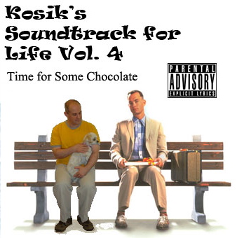
It's nice that the person in a yellow shirt included a shadow on his shoes but the edges are solid and visible. It would be better if the edges were refined. What's also nice is that he looks like he's sitting on the bench even if he wasn't. The Parental Advisory sign gives the realistic effect of it being the cover of an album. The color black for the texts above is nice because it doesn't hurt the eye while seeing it. The typography could be improved by having better choices of font and font styles.
It's nice that the person in a yellow shirt included a shadow on his shoes but the edges are solid and visible. It would be better if the edges were refined. What's also nice is that he looks like he's sitting on the bench even if he wasn't. The Parental Advisory sign gives the realistic effect of it being the cover of an album. The color black for the texts above is nice because it doesn't hurt the eye while seeing it. The typography could be improved by having better choices of font and font styles.
